Once your content is attracting and engaging an audience, the logic next step is optimizing their actions and journey. In the same way that signs and lamps guide physical journeys, the intended pathways for progression from targets (interest) and audience (watching) to actors (engaging / customers) need to be defined.
Specifically in the case of YouTube videos, an effective implementation of those pathways comes in the form of End Screens.
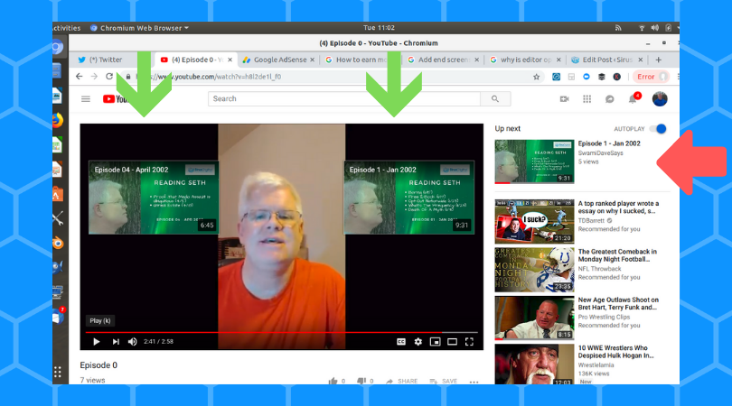
For those not familiar, this is what a YouTube End Screen looks like. It is a tool to introduce follow-up actions that viewers can take after consuming your content.

In the video displayed above (link here), two End Screens display near the end of the video. The End Screens offer additional content as a logical follow-up to what the viewer just watched.
Left Block
This video selection is selected by YouTube to be most-appropriate for the viewer.
Right Block
This video selection was intentionally chosen. (Note: This specific sub-channel is laid out in an episodic format. The viewer would be completing Episode 0 and this End Screen element would direct them to Episode 1.)
For instructions to create your own End Screens, this link from Google Support provides details.
Overview
- Your video is required to be at least 25 seconds to utilize End Screens. (YouTube is a content platform! They do not intend for you to publish an End Screen “commerical”. #SNS)
- Plan your videos with End Screens in mind! (Be sure to include space during production for where your End Screens will go.)
- A 15-20 second audio segment that plays over a static graphic screen after the content ends is a common template.
- Zooming out during your End Screen segment enables narration / description as an integrated part of the content.
- YouTube (and Google) refer to End Screens as “Elements”.
- Your video can have up to four (4) End Screens (Elements) that you configure.
- There are five basic types of Elements.
- Video (You choose whether to display your Most Recent Video, Allow YouTube To Select Best-Suited For Viewer, or Pick A Video / Playlist. Unless you have specific reasons otherwise [see below – Killer Video], it is recommended to allow YouTube to select the best-suited. )
- Playlist (If you have videos organized into a Playlist, you can direct traffic to that group of videos in this manner.)
- Subscribe (Subscribes viewer to your channel.)
- Channel (Directs viewer to another channel. This can be used for cross-promotional purposes.)
- Approved Websites (If you are a a member of the YouTube Partner Program (YTPP), you can direct traffic to your blog or promotional site.)
How To Layout Your End Screens
YouTube provides a number of templates and editing capabilities for Element placement. You can add from one-to-four (1-4) Elements.
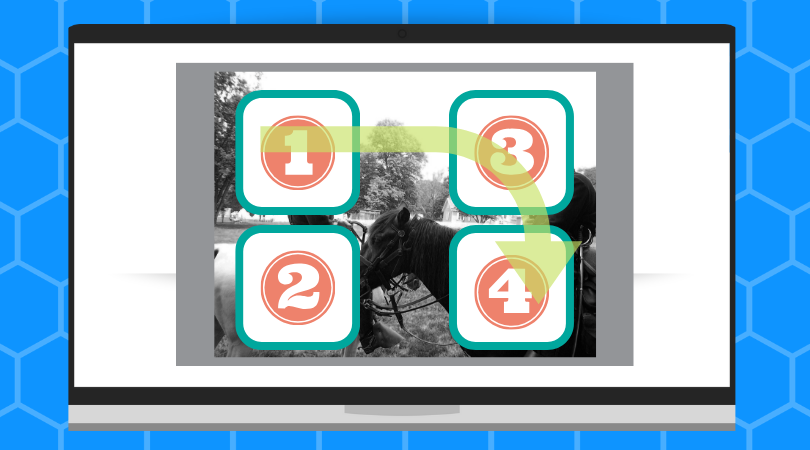
Assuming that you utilize the available four placements, the graphic below gives an example of how you might lay out your elements. (Note: The green arrow overlay highlights how US audiences have been conditioned to process information (Left->Right; Top->Down). It is outside the scope of this article to go into details like tendencies, behaviors, and psychology.)

Assuming this layout, here is a possible layout.
- Subscribe – If you have attracted the viewer’s attention, this option continues the relationship. (Note: Unless the viewer found your content via direct search or navigation, each of the other options assumes a continued interrupt of their previously-intended action-flow. Subscribing (and checking back later) is the least-intrusive option for continuation.)
- <Options>
- Members of YTPP (see above) – This is a good location to link your website. About or Creator / Company Info are good options. It allows interested viewers a low-commitment pathway to additional information.
- Non-members – This can be a good default location for a “direct conversation” video for the creator. (Use it as another opportunity for your audience to hear from you!)
- If none of the above apply, you can configure this spot as a YouTube Viewer Best-Suited option (or just leave it empty).
- Pick A Video – For creators supporting a Viewer / Customer journey, this content position is very important. In most cases, this would direct viewers to their next logical content to consume or action to take. (see reference below)
- <Options>
- Members of YTPP (see above) – This is the spot to add a Link element type directing the viewer to a conversion action. (If you have a Lead Magnet or Offer relevant to the video content, this would be the placement.)
- Non-members of YTPP – Configure this spot as a YouTube Viewer Best-Suited option
Note: Results can vary specific to placement in positions three and four. Depending upon audience temperature (cold audience / warm audience / converting audience), you should test results for those slots. Variables (such as the type of content, traffic acquisition method, and audience’s experience with your brand) will affect their effectiveness.
Alternatives For Killer Videos
For creators who are implementing Killer Video styled content, here are a few recommendations and alternatives to consider:
- Keep Subscribe element in Position 1
- Position 2 is no longer optional. It should be your Link to your intended converting action (i.e. Lead Magnet, Email Opt-In, Schedule For Consultation, etc).
- Positions 3 & 4 are now Pick A Video, but you can offer your different sub-segments different follow-up content.
Remember
One powerful technique of the Killer Video style is multiple Teases that more specifically identify and attract your audience. In the same way that you can more directly speak to the focused segments, using End Screens in this fashion allows you to create better pathways to guide them along your intended journey.
These audience pathways can be as simple or as complex as you choose to design them. The more specific and sub-segmented that you speak to your audience, the more engaged and actionable they become.
As was mentioned earlier, implementing a Killer Video model is a long-tail play. It adds complexity and sometimes sacrifices short-term conversion opportunities in favor of building a deeper long-term relationship.
As with other things, the rewards far outweigh the extra effort that you have to invest to set it in motion.
Recap
This material is a piece within the Killer Video category produced by SirusDigital. The cornerstone piece of is a free webinar that you can view starting at this post.
- How To Get Longer Views Of A YouTube Ad
- Quickest Tactic To Make Your Videos More Effective
- Supercharge Your YouTube Endcards
- Biggest Mistake Video Creators Make


